
I designed my album cover using photoshop.
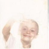
Firstly i began with a simple image of our artist (B money) as i felt it was important that i built around the main feature of the album. In this case i took a picture that had a look of rebelious behaviour yet controlled to connotate the ideas a emotions of he artist we ar creating. I think this image is extremely striking and would appeal to an audience who desire ground breaking music that deals with such issues in a post modern way,tackling ideas of rebellious behaviour in the music industry.
I then look at enhancing the photo such as adding an outer glow in order to make the image stand out. I also then added promotion of our record label, placing the brand name on the cover twice as i felt in todays music industry this is something that is usual done to promote record labels. So to add to the realism of the cover i felt it was only neccessary. Additionally I have added a parent advisory label, also conventional of controversial music.

I then went on the add text sycronising with the colour scheme, and i felt that by manually enhancing the boldness of the name it made it a dominant feature, however not taking away from the powerful picture that stands behind.

I felt that my album cover was a success and was similar to ones we see in the music industry today. Although kept very minimalistic, i feel the cover connotes a real senseof power about the artist and displays his genre of pop/ hip hop music that is looking to change the industry in the way of the artist personality to rebel.
No comments:
Post a Comment